Gladstone NOW: The Campaign Join Us on the Journey✕
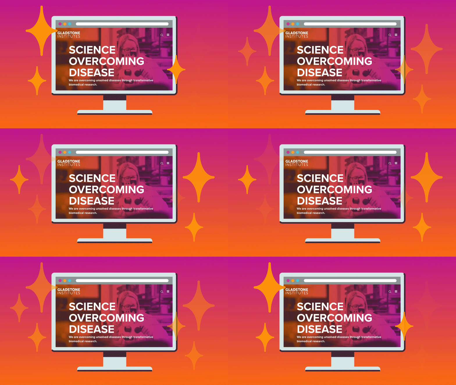
Gladstone adopted a user-centered design approach to develop the new digital face of Gladstone’s brand.
You may have noticed, the Gladstone Institutes website looks a little different these days. That’s right, Gladstone has launched a brand-new website. This newly designed site comes after months of research, collaboration, and development. The team behind the website took a user-centered approach to design, craft, and build the site. Now that it’s live, we’re excited to share the results with you.
A User-Centered Approach
A lot of people are coming to the Gladstone website, and they all have different interests and needs. Potential grad students or postdocs are searching for how to join a research team. Industry partners are looking for ways to collaborate with us. Donors want to know more about the impact of our science. And of course, some of you are just looking to find out what the latest news is on finding a cure to Alzheimer’s disease, HIV, or other diseases.
In order to really understand these different types of users, the Communications Team met with various groups across the organization to define the needs and habits of all these different audiences.
What questions are potential postdocs asking before making the decision to work at Gladstone? What does a corporate partner want to know about our work? What articles or videos are driving readers to our website?
Through these conversations, our current website analytics, as well as other external research, we defined six main user groups. For each group, we created user personas, defining a full personality to represent the group. We gave them a name, location, identified their favorite websites, where they got their news, and more.
Through this process, we kept our users at the center of everything we created, from the design layout of the homepage, to the call to action on each button. It was important that we made it as easy as possible for each visitor to find exactly what they were looking for.
Designing for Accessibility
We want to ensure that everyone has a good experience visiting the Gladstone website, regardless of physical or situational disabilities. It’s estimated that less than 10 percent of websites are accessible to all users. Gladstone worked with the firm Forum One, which has expertise in accessibility, to inform the design of the new website, ensuring that the site is available to more users. We’ve also made it regular practice to have clear headers and descriptive alt-text on each page for users who rely on screen readers.
But we know that accessibility is not a one-and-done event. We plan to regularly review our website and keep it up-to-date with the Web Content Accessibility Guidelines.
Content Development and Strategy
We want to provide more of the content that you and our other audiences are interested in, and we want to share it in new and compelling ways. In addition to featuring Gladstone’s latest scientific findings, we’re aiming to tell more personal stories through a variety of mediums and give you an insider look at Gladstone and our work.
Discover how Gladstone scientists are coming together, using cutting-edge technology to tackle heart disease, HIV, Alzheimer’s disease, and more.
Read personal accounts from those who’ve been most impacted by our outreach programs and scientific research.
Flip through slideshows of fun events happening throughout the building and get a taste of life at Gladstone.
This is just the start of what we have planned to expand our content strategy. Expect to see more videos and graphics, and more ways to engage with us across the web.
Cool New Features
We didn’t just put a new coat of paint on our old website. We completely reevaluated the structure, text, photos, and overall experience.
Here are some new features you can find on the new website.
Training
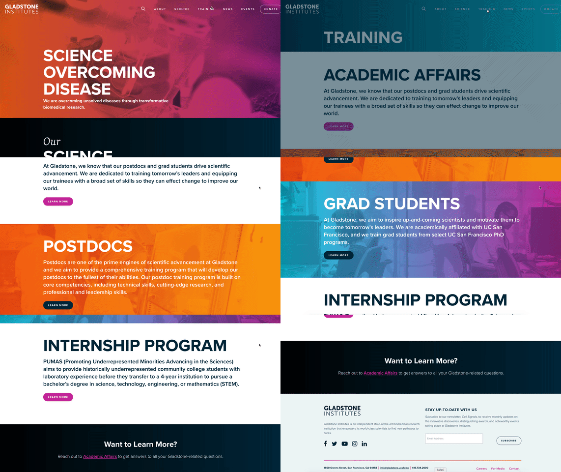
We have a fully fleshed out section on Gladstone’s training programs. “Training tomorrow’s leaders” is literally part of our mission. So, we thought it was pretty important that it was right there, front and center. Check out programming for postdocs and grad students on the Academic Affairs page, or learn a little more about what it’s like to live and work in San Francisco.
News
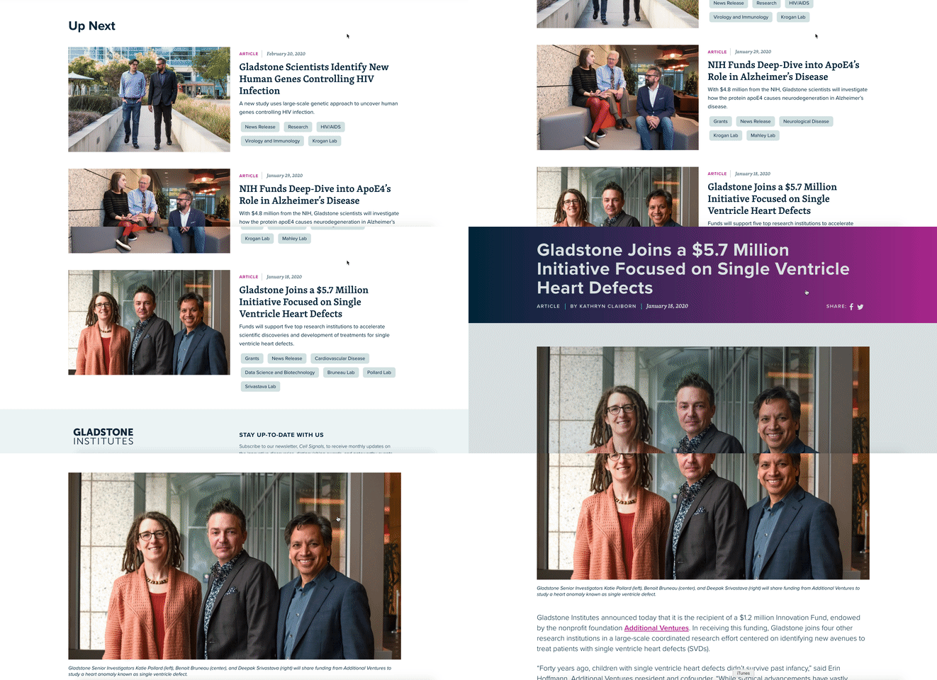
You can now easily search for articles, videos, or photo albums, making it easier to find exactly what you’re looking for.
At the end of each story, you’ll see a queue of related stories so you can keep learning more about the cool stuff happening at Gladstone.
Science
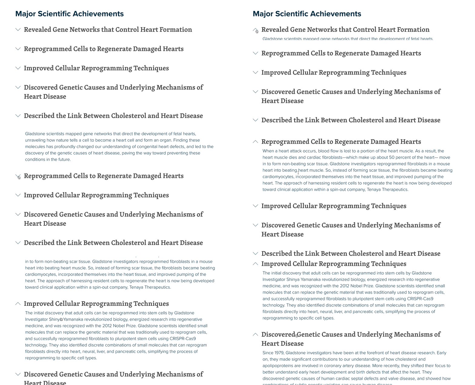
Want to dig deeper into the science at Gladstone? Explore the pages for our four institutes and learn more about their latest discoveries and their major scientific achievements.
What’s Next?
This launch is just the first stage of the new Gladstone website. Part of a user-centered design is actually listening to our real-life users, through data and analytics. What pages are you engaging with? What information is missing? Keeping in line with our core values, we plan to keep iterating and evolving this website to make sure it’s current and relevant.
We have a lot of new features and ideas already in the works. Disease FAQs, staff directory, videos, and more ways to connect. Let us know what you think of the new site.
Want to Join the Team?
Our people are our most important asset. We offer a wide array of career opportunities both in our administrative offices and in our labs.
Explore CareersGladstone Expands Research Footprint With 105,000 Square Feet of New Laboratory Space
Gladstone Expands Research Footprint With 105,000 Square Feet of New Laboratory Space
Gladstone Institutes is adding state-of-the-art laboratories in a newly constructed Mission Bay building.
History Institutional News News Release Genomic Immunology Data Science and Biotechnology Marson Lab Pollard Lab AI CRISPR/Gene Editing GenomicsOne Person’s Final Gift to Science Gets Us Closer to an HIV Cure
One Person’s Final Gift to Science Gets Us Closer to an HIV Cure
A new documentary follows Jim Dunn’s end-of-life decision to donate his tissues to HIV research.
Institutional News HIV/AIDS Infectious Disease Roan LabBeyond Viruses: Expanding the Fight Against Infectious Diseases
Beyond Viruses: Expanding the Fight Against Infectious Diseases
The newly renamed Gladstone Infectious Disease Institute broadens its mission to address global health threats ranging from antibiotic resistance to infections that cause chronic diseases.
Institutional News News Release Cancer COVID-19 Hepatitis C HIV/AIDS Zika Virus Infectious Disease

